Showing posts with label architecture. Show all posts

Sunday, February 13, 2011

Word of the Week: Halcyon


Sand Hill Crane by James John Audubon
"A halcyon is a mythical bird—often identified as a kingfisher—said to breed in a floating nest at sea during the winter solstice, during which time it charms the wind and waves into calm." 

So goes the first sentence from the Wiki entry “halcyon.”

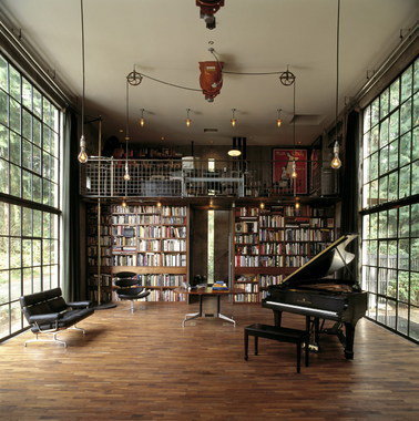
Nothing inspires me to write like my love of language and the interconnected world that language shows us…so I jump back into this blog with a short recap of why the word halcyon is my word of the week. It begins with the new restaurant at the Mint Museum of Art’s new uptown location - Halcyon, Flavors of the Earth. For one, I love that the restaurant’s name could be the (perhaps overly romantic) title of an art history paper. Secondly, I’ve been excited to dine here based on their menu’s focus on locally sourced ingredients and the rumor of presentation that befits their location in Charlotte’s leading museum.

In brief, the restaurant and meal was amazing. The interior conveys a welcoming feel - an accomplishment considering the scale and materials of the museum’s architecture. Tables made from an oak tree felled by a storm along Queens Road last year lend warmth and history and a bit of restrained magic to the space.

Continue to that afternoon, post-lunch, reading a review of Asian hotels, mostly in China (of course- where else is any building occurring right now?). The article referred to a hotel along Shanghai’s Bund standing as a “21st-century landmark that would also reflect the Bund's halcyon days.” What? I thought halcyon referred to tranquility and calm? So I went to my dictionary; halcyon also refers to a previous era or yesteryear.

As any good contemporary citizen would, I then searched wiki and found: “a mythical bird…said to breed in a floating nest at sea during the winter solstice, during which time it charms the wind and waves into calm (1).
The image called to mind by that description – I wish Audubon had watercolored that though Turner may be a better fit. That height of naturalist paintings in the 19th century where fantasy met reality brings me back to a lunch where a beautiful dish spoke to the exquisite flavors that the earth provides and the art inspired by it.


1. The name of the halcyon bird is based on the Greek myth of Alcyone, who, as is the case in most ancient myths, attempted suicide because her love was killed by the gods. Of course, as she throws herself into the ocean, the gods regain their compassion (typical) and change her and her restored lover into halcyon birds.

Thursday, November 18, 2010

2010: A Good Year?

It’s the third Thursday in November, which means the release of this year’s Beaujolais Nouveau vintage. To pay tribute to this world wide celebration of the vine, I’ve pulled out a few of my favorite examples of wine-related architecture.

Herzog and de Meuron’s Dominus winery is probably the best known winery in architectural circles for its context-driven design. The building envelope garnered much of the fame, constructed as a gabion system – wire cages filled with large rocks – that screens the light without blocking the free flow of temperate Napa Valley air.
Dominus Winery by Herzog and de Meuron, Napa Valley, 1998. 
hen there’s the barrel cellar, my favorite part of the winery, where the mass and density of the surrounding earth stabilizes air temperature and humidity while minimizing vibrations – ideal conditions for wine storage. I’ll limit myself to three examples here: the 18th century cellars of Loimer winery in Austria, the sweeping arcs of the concrete cellars at Bodegas Otazu in Spain, and Stephen Holl’s restoration of the labyrinthine wine cellars dating back to 1100 AD for the Loisum Visitors’ Centre in Austria. I know this last one is mostly for looks, but what can I say? I have a thing for old world tunnels.
Loimer's 18th century cellars, restored by Andreas Burghardt Architect, Austria, 2002.
Bodegas Otazu's barrel cellars by Jaime Gaztelu Quijano Architect, Spain, 1997.
Loisium Visitors' Centre by Steven Holl Architects, Austria, 2003.

 On to the drinking part of this tour! Tasting rooms have become architectural jewels in and of themselves, but I appreciate the subdued simplicity of Peregrine’s tasting bar in New Zealand by Architectural Workshop. 
Peregrine Tasting Bar by Architecture Workshop, New Zealand, 2003.
Let’s end on a ridiculous, obviously pre-Recession example: the Radisson BLU Hotel’s Wine Tower in the London Stansted Airport. Within a 13-meter high, temperature controlled cube where bottles are illuminated by NASA-engineered lighting systems, trained acrobat servers called “wine angels” move wine safely from tower to table via a computerized pulley system. Ticket change to Vegas, anyone?
Wine Tower by Elimun8 & Speirs and Major Associates, London, 2004.

Tuesday, November 16, 2010

Hometown Hero


NCDT's David-Ingram (Costume by Erika Diamond. Photo by Jeff Cravotta)
This weekend’s North Carolina Dance Theatre performance was still on my mind this morning so indulge  me for one more post. I took another look at the program, searching for the name of the choreographer and lighting designer on my favorite piece of the night called Arson. That’s when it hit me – Choreographer: David Ingram. I knew it sounded familiar. Ingram hails from East Tennessee, more specifically, Kingsport, Tennessee, which happens to be where yours truly was born and raised. In fact, I think David was Fritz the year I played Clara. Let's just say he's grown up quite a bit since I saw him last, and I approve.
Enough of that, let’s talk about Arson. I’ll admit, the design did it for me: costumes by Lindsey Bruck, set and lighting design by John P. Woodey. The backdrop to the stage was removed, exposing the architecture of the Knight Theater backstage that normally lives hidden from the audience’s view. A single sheet of white fabric draped the back wall from the flyspace to the stage floor.
The great height and added depth were magnified by the performers occupying the stage space and the lighting design, which included several utilitarian metal light cages like those you’d find on a construction site hanging in rows downstage. These pendant lights would increase and decrease in intensity throughout the number, the light shifting from a bright white to a warm yellow, while dancers alternated swinging specific pendants front and back as they moved between and around them.
The effect was such that the entire space of the theater was altered, the scale reconfigured, color drained to sepia tones.  Music by Hangedup, Ben Frost, Rachel Grimes and Piano Magic alternated strings and distortion over heavy bass tones that made the entire theater seem to expand and retract in rhythm like a diaphragm. I was mesmerized.
So here’s to David Ingram, the hometown hero who made his professional choreographic debut at this year’s Innovative Works series, and to the designers, musicians, and performers who made it more than choreography.

Monday, November 15, 2010

Picking up the Slack


NCDT's Kara Wilkes in costume designed by Erika Diamond. Photo by Jeff Cravotta
Thanks to a thoughtful friend, I had the pleasure of attending North Carolina Dance Theatre’s “Innovative Works” performance last Saturday night, which as you might have guessed, featured a series of original pieces by emerging and established choreographers created specifically for the NCDT dancers. While this outpouring of new ideas and energy can sometimes go amiss here and there, Saturday’s performance was one stellar performance after another.
That said, if I had to choose a weak link, it would have to be the opening number, which mixed language and movement in a way that frankly didn’t work. I enjoyed the movement, how can you not enjoy watching these performers own the stage, but the premise – a beatnik-inspired setting complete with bongo drums and moments of spoken word between which the dancers would perform a movement series – seemed oddly dated, considering the “eco” theme that drove the evening’s program. More than that, the words didn’t connect with the movement.
That got me thinking. The arts have such power because they defy words. Art replaces words with movement, sound, images, color. Architecture, too, does a bit of this, offering spatial experience as explanation of what architects do. How do you add words with it becoming forced? Didactic?
Art and architecture should never have to pick up where words leave off or vice versa. It the dialog between the two that gives texture and depth to the experience.
The first number on Saturday night required the dancers to pick up the slack, and, believe me, they did beautifully. While it didn’t detract from my evening, that uneven exchange clarified to me why I care about what I do as a writer and editor in design and the arts. Maybe NCDT will get one of my kind involved next time.

Tuesday, September 14, 2010

I Heart Book Sales

I cannot resist a book sale, especially if books on art and architecture are involved and even more especially if the proceeds are for a pet cause of mine. So attention friends: if you live in or plan on visiting the Queen City September 24th or 25th, don’t miss the Art, Architecture, & Photography Used Book Sale at Hodges Taylor Gallery in Uptown Charlotte. Held by the Friends of the Library, all proceeds benefit our local libraries and new boxes will be unpacked continuously so check it out both days if you can. And tell your friends because we in the industry need the reduced prices, Great Recession or no.

For all you dance, music, theater, and film devotees, the Friends of the Library will feature a Book Sale for those areas of interest on Saturday, October 16th, so mark your calendar.

Just in case you're due for an act of all-out altruism, pick up a book or two for me. I'll miss the sale due to a long scheduled trip – horror!

Thursday, September 2, 2010

Model City Economics

Model cities: who doesn’t love to look at miniatures of real life places and take in the bird’s eye view of a city made comprehensible by its micro-sized rendition. Now imagine that model being made of trash – reclaimed bits of detritus modeled, sculpted, and repurposed into backyards, condo towers, or the great lights of Broadway.

Enter Max Liboiron, an artist and academic who creates “walk-in, miniature dioramas” from a city’s discards. Her most recent work, The New York City Trash Exchange, opening September 9th at the AC Institute, represents none other than the great city itself and is, yes indeed, composed of New York City trash.

Max Liboiron, "The New York City Trash Exchange" (2010)
Liboiron’s work is more than a fun introduction to trash activism. Issues of economy and exchange value play out in the exhibition of the small cities.  In some cases, the parts of the installation are to be taken away by patrons free of charge since the visitor’s own trash might be included in the work itself.

Other installations are based on a barter economy. Visitors are free to take away a piece of the installation as long as they replace it with something of equal or greater value in return. The irony of gauging trash’s value is not lost on artist or viewer.

Max Liboiron, "The Dawson City Trash Project" (2008)
 Liboiron’s work also invokes the archeological, as in Material Afterlife: Circulation where she created 139 lawnscapes and 70 cars then tracked their location as they were taken away by gallery patrons. Liboiron mapped her sculptures’ movement across the continent, like so many migratory birds. For its lowly origins in the city dump, it’s hard not to see the poetry.

Monday, July 19, 2010

I Heart Bookshelves

Another tip of the hat today, this time to Bookshelf Porn, the online photo collection for people who *heart* bookshelves, i.e. erotica for book-obsessed individuals like myself. (A big thank you to my art historian friend, Roberto, for sharing this fantastic find.)

Below are a few examples to whet your appetite. More are added to the Bookshelf Porn site daily. By all means, if you have a bookshelf to show off, submit it!

 And I can't resist this one - a rule by which I try to live (she says as she completes her entry for the day). Ah, the contradictions of modern life.


Staying on subject, here's one of those fun intersections of life. I came across this book last week while browsing the shelves at Paper Skyscraper (which is incidentally the best design bookstore and best gift shop overall in Charlotte): Unpacking My Library: Architects and Their Books.

Featuring bookshelves in the offices or homes of starchitects like Tschumi, Williams Tsien, Toshiko Mori, and Michael Graves, the book offers what everyone knows to be the truth about a personal book collection: revelations of heart, soul, and mind. Of course, despite all those big architecture names, it's really the scholar's list I want to see: that of Michael Sorkin, also in the book and a potential subject for a future "I heart" post.

Thursday, July 15, 2010

Tip of the Hat to: Josef Frank

After admiring Google's tip of the hat to Josef Frank this morning, I couldn't help but take another look at his whimsical textile designs. If you're unfamiliar with Frank's work, consider the recent movie version of Mamma Mia! Whether you like musicals or not, the sets in that movie were absolutely breathtaking: clean whites and blues of the Greek coast as backdrop to brilliant textiles, which happen to be, eh hem, Josef Frank designs.
 Textile design by Josef Frank featured in Mamma Mia!

Watching that movie, (and yes, I like musicals), I immediately wanted to know the origin of those fabrics. Leave it to Design*Sponge to show the way. You know it's good design when even 60 years or more after their original creation, the patterns still seem contemporary. Gotta love those Scandinavians. Design is in their blood.
Textile design by Josef Frank
Exhibiting qualities of whimsy and the baroque as well as a surrealist approach to form, Frank's fabrics invoke such a different side of the imagination than his contemporaries in the Bauhaus and moderne movements. When all was being whittled down to streamlines or orthographic formalism, Frank produced these refined but expressive forms that we still love today.
 Textile design by Josef Frank on sofa by Anthropologie

Tuesday, April 27, 2010

Ode to Ovation


A simple ode to Ovation, the cable channel that exists for the pleasure of the nerdy few. It is no Bravo - no omnipresent, handsome gay man or beautiful rich bitch. How it stays on air, I don't know. There can't be that many people interested in things like a honky-tonk singer turned opera performer or the design origin of greeting cards, but I don't mind minimal company. So here's to a few favorite Ovation moments:

Designer People - Ovation, why didn't you come to me before Amy Devers? I'm so much cooler (though I'll admit my wardrobe isn't).

Later with Jools Holland - Here's to musical talent and small venues but why 4AM?! Another reason to have TiVo.

Bathroom Divas - That honky tonk singer I was talking about? Episode 3.

Reality TV - About up and coming photographers, dancers, musicians, artists, and designers. Sure Project Runway started it all, but Ovation took into disciplines other channels wouldn't dare.

Documentaries -  On every artist, architect, musician, and designer worth mentioning and beyond. I celebrate a channel whose core content is built on these sorts of productions.

Tuesday, April 20, 2010

The Musical With Something Extra

Part of my job is to read. I know, it's terrible but someone's got to do it. One genre that I follow on a daily basis is criticism. Literature, art, theater, architecture, film, typography, you name it: criticism speaks directly to its subject and attempts to engage the reader - novice and expert alike - in evaluating that subject, not as being good or bad per se but, instead, relevant or no, influential, tangible, topical, etc. Criticism puts creative work into perspective. It provides informative reviews of a given object, play, or building's place in the historical/cultural/socio-political spectrum and how it may exceed or fall short in comparison. Information equally prepares every creative professional to jump the quality divide - thus how good criticism can alter the course of careers and professions.

Architects hate criticism, but I think that stems from years of brow beating in school by smug professors who have never learned how to be good (read: constructive) critics. So I will not list an architectural review today. Instead, let's talk theater posters.


Yesterday the New York Times reviewed the new production of "La Cage aux Folles," the French musical production that became in the 1996 English movie translation, "The Birdcage" starring Robin Williams and Nathan Lane. It is a well-written piece by Ben Brantley (click here for the theatre review), but more interesting is the interactive feature on the design development for the production's poster art, "Ad Evolution: La Cage aux Folles." The interactive feature reveals a number of proposals for the ad campaign by NY creative agency SpotCo with voice overs by agency founder Drew Hodges. Click on an individual poster, and you get a closer look with Mr. Hodges relaying the inspiration for each design and the reason why it was (in the case of the final version) or was not chosen for the campaign.

There are some fantastic ideas here. I love the yellow show "girl" with the big red lips, but Mr. Hodges is right - that text is too small for Times Square. The simplicity of the pink poster with falsies, mustache, and the show's name in lights is another favorite as is the neon option near the end. The final version is excellent of course, but forgive me if I feel like I've seen it before - someone please help me remember where. Yes, I get the playful notion of the sex objects in heels and feathers being men instead of women, and this ad is so New York City.  I guess I just go for whimsy or Studio 54. When this show hits Miami, one of these other posters should travel with it.

Saturday, January 30, 2010

Architecture as Social Critique: Holl in Beijing

Architecture as a form of social critique: we’ve moved past that, right? As practitioners, as historians, as a society that learned the lessons of modernism and reveled in the erudition of postmodernism?
Here’s what sparked this post: Holl’s new building in Beijing, the so-called Linked Hybrid. Now some would argue that architecture cannot be critiqued in the same way as, say, a sculpture or painting, but art criticism is where I started - those be my roots- so forgive me if I want to talk about the cultural production that we call the built environment in ways that reflect the social, political, and aesthetic context of its making. So perhaps you understand how, when that glossy AR cover (Architectural Record, January 2010) came to occupy my breakfast table this morning, I saw a building that spoke to a social condition in a way that the buildings on that cover have not in some time. 

Full disclaimer, I was one of those who spat venom at the starchitects and little guys alike who went running to the money pouring out of China and the Middle East in the past decade. Many defended their work under the guise of buzzwords like “global community” or argued that they were bringing inspiration to the oppressed masses in the form of a free, democratic building style (Architectural Record, July 2008). Let’s just say that I found those excuses unacceptable, simply means by which they could avert their gaze from the reality of those situations – slave labor where expenditures could sometimes mean the occasional life or money being pulled from the starving underclass to feed a newly developing upper class and an ambitious government’s deadline for presence on the world stage.
Don’t get me wrong. I have nothing against the dollar. I like money and wish I had more, but I also have ethics which lead me to despise those who would gain a dollar at someone else’s expense, especially a disenfranchised cog in the authoritarian machine.
Take that for what it is. Let’s talk about what I saw on that cover.
At first glance, Holl’s building elevations are oppressive, concrete grids, stiff exoskeletons that provide the primary structural support. The effect is heavy and there’s no tripartite scheme here to lighten the mood – just the grinding monotony, the equidistant spacing, the squares multiplying up and down, left and right. No cornice to end the march; the building just stops. And there are eight of these buildings, clustered in this new development just outside Beijing’s Second Ring Road. Honestly, the scheme immediately brings to mind Soviet architecture in East Berlin, which did a good job of this sort of building-for-the-people that lacks any sense of life’s color or vitality.
Maybe it was the fresh coffee and morning light, but something sparked. Before I read the feature article (and Holl’s statement that he would never do a project that “relocates” people – Good for you, guy, I guess) I suddenly saw the building grid as representative of the people in the Chinese communist system, each counting equally, square by square, separated from each other by the heavy hand of government supervision. The containment of each individual is palpable.
But then Holl and his Beijing-based partner Li Hu begin to offer opportunities for subversion, slight changes in the grid that suggest an unstoppable human spirit. Diagonals run across small sectors of the building, not breaking the grid or even severing the barriers between squares, but connecting two, sometimes four individuals at a time. This is a slight subversion of the order but enough to hint at the human will to connect and engage, even while operating within the grid’s structure. (Yeah, yeah, after reading the article, I understand that these diagonals are actually the lines of structural support, but why should that deflect interpretation?)

Then come those large swaths of color – the bridges that penetrate and connect these blocky volumes, reordering the grid at its moments of intersection. Like a beam of colored light bouncing off of surfaces, these bridges seem to represent those streams or digital flows of information that are cutting through the society. Try as you might, you cannot block out those outside influences and dialogs. People will connect to the world. They will be exposed to the outside. Being found out is inevitable.
All of a sudden what looked like oppressive blocks with novelty bridges become a subversion of power. Revolution in construction.
Is this what Holl and Hu intended with their building? Probably not, but I will persist. Irony in design is too rare in architecture. To find it in Beijing is the only positive sign I’ve seen in the field recently. I’ll take it.