Thanks for checking in! For the latest news and posts, go to Speak Your Design's official website: http://speakyourdesign.com/
Best wishes,
Jessica Thomas
Owner, Speak Your Design
Monday, July 30, 2012


Monday, February 14, 2011
BuzZ February Recap :: Good Copy is Good Design
This post was written for the AIGA Charlotte's blog as a recap of the BuzZ session I led on February 2nd.
Most of us are aware of the contrived conflict between designers and non-designers, the latter including copywriters. Designers cite experiences with writers who don’t know what the word “edit” means or who simply want a designed template into which they can insert written content without regard for the dynamic between the design of the page and the words on it.
Likewise, writers put designers into a few general categories: those who let the content inform their design process – more of these please; those who give graphic hierarchy to the copy but don’t otherwise base design decisions on its content; and then there’s that small lot of designers who consider words the bane of their design existence – not fun.
However, though the training and deliverables assume different forms, copywriting parallels design work in practice. Copywriting is: Creative, Idea-intensive, Client-based, Deadline-driven, a Business, and a Communicative Art. The session’s title, “Good Copy is Good Design,” refers to this parallel and to the broader definition of design as intent, planning, or composition.
Team work, people.
With everyone in agreement that the best product comes from a collaborative process with valuable (and valued) input coming from both sides, it came down to a conversation about how designers and copywriters could better work together. A few suggestions and tools of the trade were discussed.
1. The Copy/Design Brief: Whether separate briefs are involved or the same one is used by both parties, the brief is a proven way of being sure everyone is on the same page in terms of understanding the client and their needs, audience, and core message.
2. Word Bank or Brand Dictionary: While design standards may exist for companies and institutions, this is less often the case for language. I often assemble a list of words and phrases that help me, and the designer in turn, understand the feeling and tone of voice that the final product needs to project.
For example, Google calls their employees Googlers, new employees Nooglers, Zurich employees Zooglers and so on. That in-house language gives off a particular, fun vibe that informs both company copy and design. Compare that to Disney where employees are Cast Members, and visitors are Guests. The behind-the-scenes, event-oriented feeling of that language inspires very different but equally successful, brand-specific copy and design work.
3. Character Counts: I’m not talking about middle school ethics class. The question is how many words must be on the page? This is the most common point of contention between designers and writers in my experience. The solution is simple: decide the count as soon as humanly possible.
But there’s so much to say!
One attendee asked how to present vast amounts of information without building a wall of text. A couple of options were mentioned: bullet points (which summoned a collective ugh) and infographics. When bullets are your only option, they shouldn’t be given greater design weight than the narrative that the text in paragraph form delivers. The designer and writer must work together to create a visual hierarchy that prevents the “Power Point brain” that bullets induce. Similarly, it’s the go-to graphs created by amateurs in Office programs that make us cringe, not the fantastic graphics by information designers that are rich with data and communicate quickly and effectively to the reader.
Show some respect.
The session ended on acts of professional courtesy. Designers requested an awareness of deadlines and warned against adding multiple paragraphs of text the day of or before said deadline. Writers suggested that, while they understand designs change with development, if you say 500-800 words, don’t ask the final version to be 400, especially when 650 words of content have been approved by the client after 12 painstaking rounds of review. (We knew word count would resurface. See #3 above).
Not surprisingly, both designers and copywriters expressed the desire to work in tandem. Designers prefer to design for content rather than out of thin air, and writers often find inspiration for their work in conversations about a project’s design direction. There you have it – a happy ending.
Written by Jessica Thomas, owner and editor at Speak Your Design, a writing service for arts and design based people and projects.
Sunday, February 13, 2011
Word of the Week: Halcyon
"A halcyon is a mythical bird—often identified as a kingfisher—said to breed in a floating nest at sea during the winter solstice, during which time it charms the wind and waves into calm."
Sand Hill Crane by James John Audubon

So goes the first sentence from the Wiki entry “halcyon.”
Nothing inspires me to write like my love of language and the interconnected world that language shows us…so I jump back into this blog with a short recap of why the word halcyon is my word of the week. It begins with the new restaurant at the Mint Museum of Art’s new uptown location - Halcyon, Flavors of the Earth. For one, I love that the restaurant’s name could be the (perhaps overly romantic) title of an art history paper. Secondly, I’ve been excited to dine here based on their menu’s focus on locally sourced ingredients and the rumor of presentation that befits their location in Charlotte’s leading museum.
In brief, the restaurant and meal was amazing. The interior conveys a welcoming feel - an accomplishment considering the scale and materials of the museum’s architecture. Tables made from an oak tree felled by a storm along Queens Road last year lend warmth and history and a bit of restrained magic to the space.
Continue to that afternoon, post-lunch, reading a review of Asian hotels, mostly in China (of course- where else is any building occurring right now?). The article referred to a hotel along Shanghai’s Bund standing as a “21st-century landmark that would also reflect the Bund's halcyon days.” What? I thought halcyon referred to tranquility and calm? So I went to my dictionary; halcyon also refers to a previous era or yesteryear.
As any good contemporary citizen would, I then searched wiki and found: “a mythical bird…said to breed in a floating nest at sea during the winter solstice, during which time it charms the wind and waves into calm (1).”
The image called to mind by that description – I wish Audubon had watercolored that though Turner may be a better fit. That height of naturalist paintings in the 19th century where fantasy met reality brings me back to a lunch where a beautiful dish spoke to the exquisite flavors that the earth provides and the art inspired by it.
1. The name of the halcyon bird is based on the Greek myth of Alcyone, who, as is the case in most ancient myths, attempted suicide because her love was killed by the gods. Of course, as she throws herself into the ocean, the gods regain their compassion (typical) and change her and her restored lover into halcyon birds.
Thursday, November 18, 2010
2010: A Good Year?
It’s the third Thursday in November, which means the release of this year’s Beaujolais Nouveau vintage. To pay tribute to this world wide celebration of the vine, I’ve pulled out a few of my favorite examples of wine-related architecture.
Herzog and de Meuron’s Dominus winery is probably the best known winery in architectural circles for its context-driven design. The building envelope garnered much of the fame, constructed as a gabion system – wire cages filled with large rocks – that screens the light without blocking the free flow of temperate Napa Valley air.
hen there’s the barrel cellar, my favorite part of the winery, where the mass and density of the surrounding earth stabilizes air temperature and humidity while minimizing vibrations – ideal conditions for wine storage. I’ll limit myself to three examples here: the 18th century cellars of Loimer winery in Austria, the sweeping arcs of the concrete cellars at Bodegas Otazu in Spain, and Stephen Holl’s restoration of the labyrinthine wine cellars dating back to 1100 AD for the Loisum Visitors’ Centre in Austria. I know this last one is mostly for looks, but what can I say? I have a thing for old world tunnels.
Herzog and de Meuron’s Dominus winery is probably the best known winery in architectural circles for its context-driven design. The building envelope garnered much of the fame, constructed as a gabion system – wire cages filled with large rocks – that screens the light without blocking the free flow of temperate Napa Valley air.
 |
| Dominus Winery by Herzog and de Meuron, Napa Valley, 1998. |
 |
| Loimer's 18th century cellars, restored by Andreas Burghardt Architect, Austria, 2002. |
 |
| Bodegas Otazu's barrel cellars by Jaime Gaztelu Quijano Architect, Spain, 1997. |
 |
| Loisium Visitors' Centre by Steven Holl Architects, Austria, 2003. |
On to the drinking part of this tour! Tasting rooms have become architectural jewels in and of themselves, but I appreciate the subdued simplicity of Peregrine’s tasting bar in New Zealand by Architectural Workshop.
 |
Peregrine Tasting Bar by Architecture Workshop, New Zealand, 2003. |
Let’s end on a ridiculous, obviously pre-Recession example: the Radisson BLU Hotel’s Wine Tower in the London Stansted Airport. Within a 13-meter high, temperature controlled cube where bottles are illuminated by NASA-engineered lighting systems, trained acrobat servers called “wine angels” move wine safely from tower to table via a computerized pulley system. Ticket change to Vegas, anyone?
 |
Wine Tower by Elimun8 & Speirs and Major Associates, London, 2004. |
Amateur Night
“The sudden bisociation of an idea or event with two habitually incompatible matrices will produce a comic effect, provided that the narrative, the semantic pipeline, carries the right kind of emotional tension. When the pipe is punctured, and our expectations are fooled, the now redundant tension gushes out in laughter, or is spilled in the gentler form of the sou-rire.” – Arthur Koestler, The Act of Creation*Okay, so this isn’t the only thing that came to mind when I watched an amateur comedy show recently – editing got involved, too.
The show was what you might expect: mediocre comedy with a highlight here and there, mostly jokes on adult themes, body parts and fluids, etc. But comedy, both good and bad, interests me because of its creativity.
Comedy has been a point of reference for those interested in the creative act, especially those who approach art and culture through the lens of psychoanalysis, since the 19th century. Creatively speaking, comedy is the merging of two “habitually incompatible” lines of thought that end up in that non-violent release of tension, aka laughing.
To do this well, to get people rolling in the aisles, the incompatibilities must be “implied in the text.” If you make it explicit (i.e. over-explain the structure upon which the joke is built), you “destroy the story’s comic effect.”** We all know that person who makes the funniest joke not funny by reversing the order of the joke’s elements or explaining the joke’s premise in too great detail. They’ve punctured Koestler’s pipe in too many places. The tension is diffused before that pivotal moment of release – it’s all drip, drip, instead of the desired gush.
For writers, this comes down to the fact that a good joke must be well edited. You can’t give too much away too early, and the punch line can’t be blurted out without the build. Sure, a good comedian must have stage presence and good delivery, too, but even the latter is built on giving the audience time to develop that inner tension based on the smallest number of words up front. Marketing copywriters work with this principle daily – when your audience isn’t expecting what’s coming, the cathartic effect makes them want to pay attention to what you have to say next. And that’s good business.
*p. 51, Arthur Koestler, The Act of Creation, The Macmillan Company: New York, 1964.
**p. 36, Koestler.
Tuesday, November 16, 2010
Hometown Hero
NCDT's David-Ingram (Costume by Erika Diamond. Photo by Jeff Cravotta)

Enough of that, let’s talk about Arson. I’ll admit, the design did it for me: costumes by Lindsey Bruck, set and lighting design by John P. Woodey. The backdrop to the stage was removed, exposing the architecture of the Knight Theater backstage that normally lives hidden from the audience’s view. A single sheet of white fabric draped the back wall from the flyspace to the stage floor.
The great height and added depth were magnified by the performers occupying the stage space and the lighting design, which included several utilitarian metal light cages like those you’d find on a construction site hanging in rows downstage. These pendant lights would increase and decrease in intensity throughout the number, the light shifting from a bright white to a warm yellow, while dancers alternated swinging specific pendants front and back as they moved between and around them.
The effect was such that the entire space of the theater was altered, the scale reconfigured, color drained to sepia tones. Music by Hangedup, Ben Frost, Rachel Grimes and Piano Magic alternated strings and distortion over heavy bass tones that made the entire theater seem to expand and retract in rhythm like a diaphragm. I was mesmerized.
So here’s to David Ingram, the hometown hero who made his professional choreographic debut at this year’s Innovative Works series, and to the designers, musicians, and performers who made it more than choreography.
Monday, November 15, 2010
Picking up the Slack
NCDT's Kara Wilkes in costume designed by Erika Diamond. Photo by Jeff Cravotta
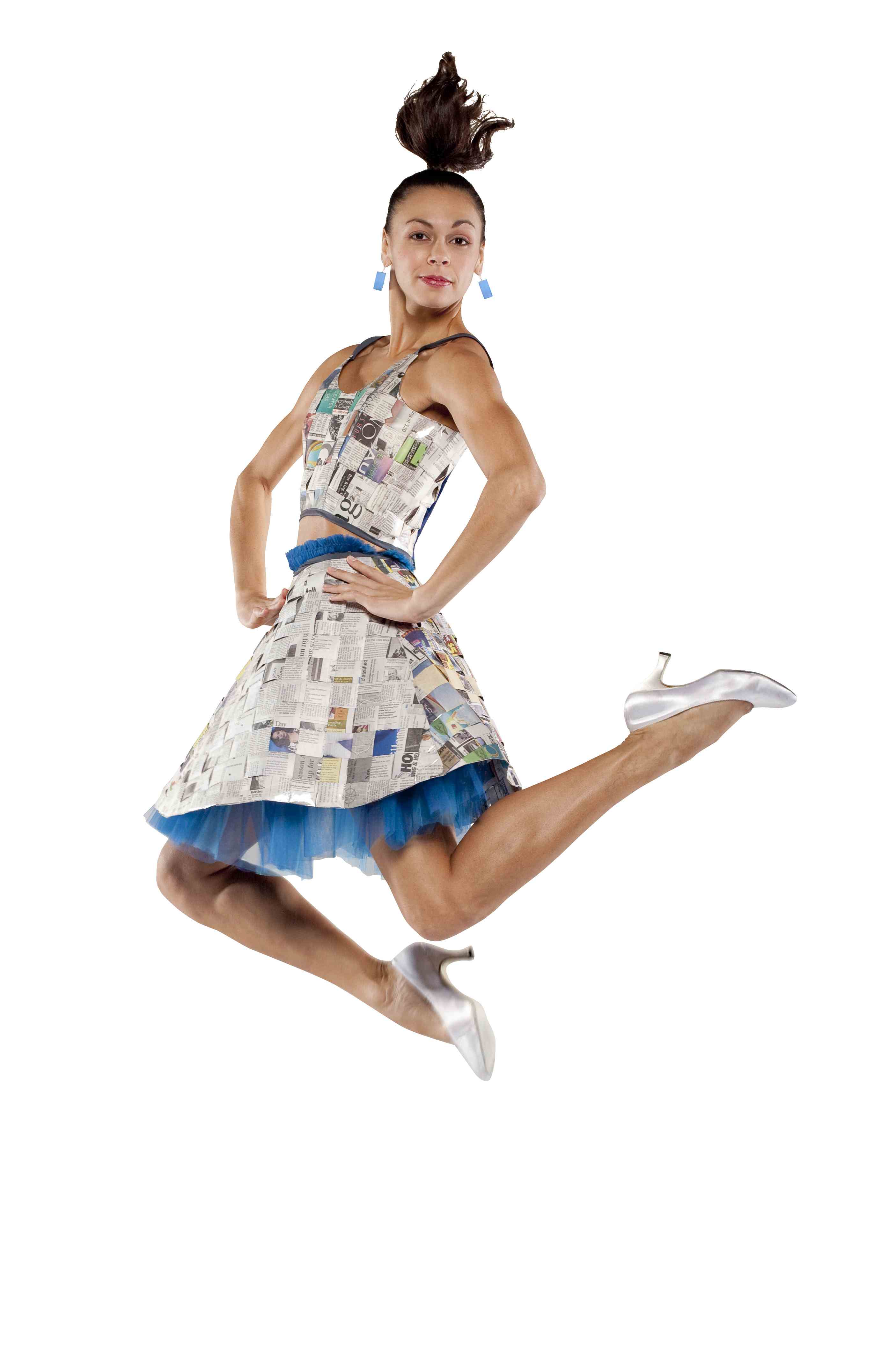
That said, if I had to choose a weak link, it would have to be the opening number, which mixed language and movement in a way that frankly didn’t work. I enjoyed the movement, how can you not enjoy watching these performers own the stage, but the premise – a beatnik-inspired setting complete with bongo drums and moments of spoken word between which the dancers would perform a movement series – seemed oddly dated, considering the “eco” theme that drove the evening’s program. More than that, the words didn’t connect with the movement.
That got me thinking. The arts have such power because they defy words. Art replaces words with movement, sound, images, color. Architecture, too, does a bit of this, offering spatial experience as explanation of what architects do. How do you add words with it becoming forced? Didactic?
Art and architecture should never have to pick up where words leave off or vice versa. It the dialog between the two that gives texture and depth to the experience.
The first number on Saturday night required the dancers to pick up the slack, and, believe me, they did beautifully. While it didn’t detract from my evening, that uneven exchange clarified to me why I care about what I do as a writer and editor in design and the arts. Maybe NCDT will get one of my kind involved next time.
Friday, October 15, 2010
Business Books that won’t turn your stomach or compromise your ethics
Okay, it’s time I put it out there. I’ve answered the same question the same way enough times to know it should have a place here.
When I was starting up my business and hitting the library for resources (thank you, library!), amid the shelves filled with titles on getting rich quick and lessons from CEOs-who-know, I discovered three books that I recommend to every person who asks me how I did it: Michelle Goodman’s The Anti 9-to-5 Guide and My So-Called Freelance Life and Lauren Bacon and Emira Mears’s The Boss of You.


Sure I waded through the many available (and free!) online resources that helped me through the process of choosing a business structure, registering with my local chamber, paying zoning fees for a home office and so forth, but these ladies’ books gave me the guidance and chutzpah to make my business happen and have a good time doing it.
Though they’re writing for women and, yes, most if not all of their examples are women-owned businesses, I recommend these books to my guy friends for the same reasons I recommend them to my ladies. First off, they’re fun reads. The authors have great senses of humor – a necessity for anyone who’s starting their own business – and they offer invaluable advice based on their and fellow business owners’ experiences.
Secondly, they offer something very different from those other books on the topic. They speak to doing business because you want something more than just money or fame or power over the universe. Of course, we all want to make money at the end of the day and I’ll admit sometimes I’d like that power over the universe part, but the point is that money is just one of many reasons most people start their own gig, myself included. As a result, their advice seems so much more honest and authentic than the shallow posturing I find in most other start-up guides.
If you’re green on the business startup process, I recommend reading the books in the order I listed above. Goodman starts from the beginning – she even walks you through finding what you want your business to be if you don’t have any idea yet – then takes you through the logistics of everything from self-discipline to healthcare to taxes. Mears and Bacon are a bit more ambitious and go so far as discussing how to grow your business, find and hire employees, and be a good boss.
Though they started as library loans, I have since purchased all three. Their resource guides and well organized chapters make them go-to references for me even now. Plus I can freely mark the margins, and we all know how I love margins.
When I was starting up my business and hitting the library for resources (thank you, library!), amid the shelves filled with titles on getting rich quick and lessons from CEOs-who-know, I discovered three books that I recommend to every person who asks me how I did it: Michelle Goodman’s The Anti 9-to-5 Guide and My So-Called Freelance Life and Lauren Bacon and Emira Mears’s The Boss of You.
Sure I waded through the many available (and free!) online resources that helped me through the process of choosing a business structure, registering with my local chamber, paying zoning fees for a home office and so forth, but these ladies’ books gave me the guidance and chutzpah to make my business happen and have a good time doing it.
Though they’re writing for women and, yes, most if not all of their examples are women-owned businesses, I recommend these books to my guy friends for the same reasons I recommend them to my ladies. First off, they’re fun reads. The authors have great senses of humor – a necessity for anyone who’s starting their own business – and they offer invaluable advice based on their and fellow business owners’ experiences.
Secondly, they offer something very different from those other books on the topic. They speak to doing business because you want something more than just money or fame or power over the universe. Of course, we all want to make money at the end of the day and I’ll admit sometimes I’d like that power over the universe part, but the point is that money is just one of many reasons most people start their own gig, myself included. As a result, their advice seems so much more honest and authentic than the shallow posturing I find in most other start-up guides.
If you’re green on the business startup process, I recommend reading the books in the order I listed above. Goodman starts from the beginning – she even walks you through finding what you want your business to be if you don’t have any idea yet – then takes you through the logistics of everything from self-discipline to healthcare to taxes. Mears and Bacon are a bit more ambitious and go so far as discussing how to grow your business, find and hire employees, and be a good boss.
Though they started as library loans, I have since purchased all three. Their resource guides and well organized chapters make them go-to references for me even now. Plus I can freely mark the margins, and we all know how I love margins.
Tuesday, September 14, 2010
I Heart Book Sales

For all you dance, music, theater, and film devotees, the Friends of the Library will feature a Book Sale for those areas of interest on Saturday, October 16th, so mark your calendar.
Just in case you're due for an act of all-out altruism, pick up a book or two for me. I'll miss the sale due to a long scheduled trip – horror!
Sunday, September 5, 2010
Man Down: Novice Gaming and Writing for Laughs
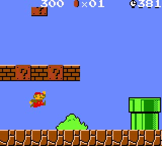
Disclaimer: I’m not a gamer. My gaming days ended with Super Mario Brothers 2. I realize that makes me a luddite amongst my peers who at least know how to play Playstation, Wii, or Xbox 360. I know how to use an Xbox as a DVD player.
So I can relate to Nicholson Baker’s recent New Yorker article, “Painkiller Deathstreak,” where he relays the frustration and absolute ridiculousness of being a video game novice. Baker is a great writer and funny, too, which means he’s a really great writer. I love breezily inserted lines like “I wish so many foreigners didn’t have to be shot, so many historical sites damaged without comment, but evidently they do,” or in explaining the portrayal of his death in one game, “the image desaturates to black-and-white and there’s a tactful moment of funereal bagpipery.” When the hero of another game finds a precious, ancient green lamp, Baker empathizes that “being an American action hero, [he] immediately breaks it like a piggy bank on the floor.”
In On Writing Well, (one of my favorite books on the craft), William Zinsser describes humor as a “special angle of vision granted to certain writers who already write good English.” Baker’s account is fantastic humor, and it’s the writing that makes it so – that delicate combination of syntax, phrasing, and wit. Humorists do serious work, as any fan of satire knows, but the presentation sets it apart from other opinion pieces as something accessible if no less controversial.
A novice’s reflections on gaming may not draw great controversy, but gamers’ tolerance to depictions of violence is one of the underlying themes of the article. E.B. White believed, “Humor is a by-product that occurs in the serious work of some and not others.” The product of disparate ideas brought together to shed light on some truth however seemingly small, humor represents the quintessential creative act.
Thursday, September 2, 2010
Model City Economics
Model cities: who doesn’t love to look at miniatures of real life places and take in the bird’s eye view of a city made comprehensible by its micro-sized rendition. Now imagine that model being made of trash – reclaimed bits of detritus modeled, sculpted, and repurposed into backyards, condo towers, or the great lights of Broadway.
Enter Max Liboiron, an artist and academic who creates “walk-in, miniature dioramas” from a city’s discards. Her most recent work, The New York City Trash Exchange, opening September 9th at the AC Institute, represents none other than the great city itself and is, yes indeed, composed of New York City trash.
Liboiron’s work is more than a fun introduction to trash activism. Issues of economy and exchange value play out in the exhibition of the small cities. In some cases, the parts of the installation are to be taken away by patrons free of charge since the visitor’s own trash might be included in the work itself.
Other installations are based on a barter economy. Visitors are free to take away a piece of the installation as long as they replace it with something of equal or greater value in return. The irony of gauging trash’s value is not lost on artist or viewer.
Enter Max Liboiron, an artist and academic who creates “walk-in, miniature dioramas” from a city’s discards. Her most recent work, The New York City Trash Exchange, opening September 9th at the AC Institute, represents none other than the great city itself and is, yes indeed, composed of New York City trash.
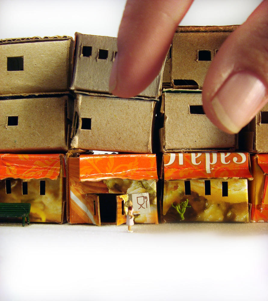 |
| Max Liboiron, "The New York City Trash Exchange" (2010) |
Other installations are based on a barter economy. Visitors are free to take away a piece of the installation as long as they replace it with something of equal or greater value in return. The irony of gauging trash’s value is not lost on artist or viewer.
- Liboiron’s work also invokes the archeological, as in Material Afterlife: Circulation where she created 139 lawnscapes and 70 cars then tracked their location as they were taken away by gallery patrons. Liboiron mapped her sculptures’ movement across the continent, like so many migratory birds. For its lowly origins in the city dump, it’s hard not to see the poetry.
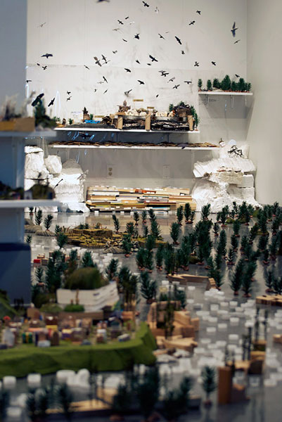 |
| Max Liboiron, "The Dawson City Trash Project" (2008) |
Tuesday, July 20, 2010
Marginal Behavior: Book Graffiti
In “Marginal," featured in the June 28 issue of The New Yorker, Author Ian Frazier relays his experience at the New York Public Library event focused around marginalia, aka those markings sketched into the body, cover, and/or margins of books, what NYPL's Anne Garner calls "book graffiti." Of course, the library wasn’t displaying just any marginalia. Selected from the library’s collection were the in-text scribbles of literary giants like Mark Twain, Jack Kerouac, William Coleridge, and Vladimir Nabokov to name a few.
For designers, marginalia are probably best equated with one of our favorite ideas – the palimpsest. Great marginalia takes on a palimpsest-like quality – the layering of thoughts, intersections, and outside references that inform and reform the text in question. This is why ebooks for all their convenience are lost on me. Sure, a digital book is great for a beach read I never plan on picking up again, but for those texts that are important to me, a digital highlighter will never replace the physical act of underlining an exquisite sentence or marking a particularly convincing passage. (Sue Halpern speaks to the digital marginalia problem in "What the iPad Can't Do" on the New York Review of Books blog.)

The most serious marginalians I’ve known in my life were philosophers. I once noticed that my philosophy mentor, a certain Mr. Casey, having read everything on the planet at least half a dozen times, created a key with dates on the inside front cover for his marginalia, i.e. black ink for the first read, blue for the second, pencil the third, double underlines on the fourth, and so on.
As an interpretive device, marginalia inspires a certain kind of faith. When returning to a text weeks, months, or years later, I always glance at my marks to get a feel for my prior readings of the material. I’m no longer surprised when my marginalia seem to be written by someone else – someone better read in some instances, more naïve other times, or enamored with an idea for a reason inconceivable to me today.
Read Frazier’s piece and decide what sort of marginalia-maker you are (I’ll admit I enjoy hostile marginalia or what I’ll call satirical marginalia, but seeds of ideas and cross references fill most of my margins).
Do you have a good example of marginalia in your library? Send it in. Perhaps an online exhibition is in order.
 |
| Image from here |

Image from the New York Review of Books
The most serious marginalians I’ve known in my life were philosophers. I once noticed that my philosophy mentor, a certain Mr. Casey, having read everything on the planet at least half a dozen times, created a key with dates on the inside front cover for his marginalia, i.e. black ink for the first read, blue for the second, pencil the third, double underlines on the fourth, and so on.
As an interpretive device, marginalia inspires a certain kind of faith. When returning to a text weeks, months, or years later, I always glance at my marks to get a feel for my prior readings of the material. I’m no longer surprised when my marginalia seem to be written by someone else – someone better read in some instances, more naïve other times, or enamored with an idea for a reason inconceivable to me today.
Read Frazier’s piece and decide what sort of marginalia-maker you are (I’ll admit I enjoy hostile marginalia or what I’ll call satirical marginalia, but seeds of ideas and cross references fill most of my margins).
Do you have a good example of marginalia in your library? Send it in. Perhaps an online exhibition is in order.
Monday, July 19, 2010
I Heart Bookshelves
Another tip of the hat today, this time to Bookshelf Porn, the online photo collection for people who *heart* bookshelves, i.e. erotica for book-obsessed individuals like myself. (A big thank you to my art historian friend, Roberto, for sharing this fantastic find.)
Below are a few examples to whet your appetite. More are added to the Bookshelf Porn site daily. By all means, if you have a bookshelf to show off, submit it!

 And I can't resist this one - a rule by which I try to live (she says as she completes her entry for the day). Ah, the contradictions of modern life.


Featuring bookshelves in the offices or homes of starchitects like Tschumi, Williams Tsien, Toshiko Mori, and Michael Graves, the book offers what everyone knows to be the truth about a personal book collection: revelations of heart, soul, and mind. Of course, despite all those big architecture names, it's really the scholar's list I want to see: that of Michael Sorkin, also in the book and a potential subject for a future "I heart" post.
Below are a few examples to whet your appetite. More are added to the Bookshelf Porn site daily. By all means, if you have a bookshelf to show off, submit it!
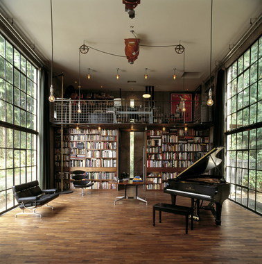
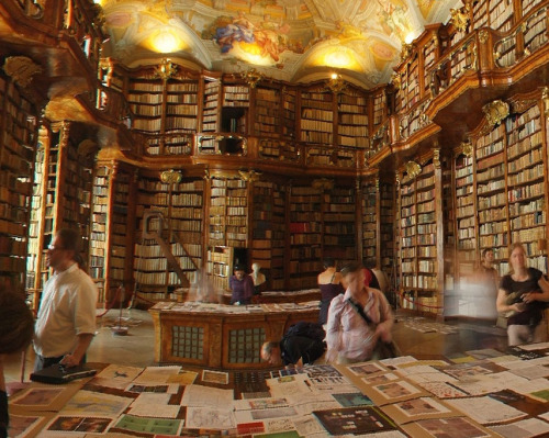

Staying on subject, here's one of those fun intersections of life. I came across this book last week while browsing the shelves at Paper Skyscraper (which is incidentally the best design bookstore and best gift shop overall in Charlotte): Unpacking My Library: Architects and Their Books.

Featuring bookshelves in the offices or homes of starchitects like Tschumi, Williams Tsien, Toshiko Mori, and Michael Graves, the book offers what everyone knows to be the truth about a personal book collection: revelations of heart, soul, and mind. Of course, despite all those big architecture names, it's really the scholar's list I want to see: that of Michael Sorkin, also in the book and a potential subject for a future "I heart" post.
Thursday, July 15, 2010
Tip of the Hat to: Josef Frank
After admiring Google's tip of the hat to Josef Frank this morning, I couldn't help but take another look at his whimsical textile designs. If you're unfamiliar with Frank's work, consider the recent movie version of Mamma Mia! Whether you like musicals or not, the sets in that movie were absolutely breathtaking: clean whites and blues of the Greek coast as backdrop to brilliant textiles, which happen to be, eh hem, Josef Frank designs.

Watching that movie, (and yes, I like musicals), I immediately wanted to know the origin of those fabrics. Leave it to Design*Sponge to show the way. You know it's good design when even 60 years or more after their original creation, the patterns still seem contemporary. Gotta love those Scandinavians. Design is in their blood.


Textile design by Josef Frank featured in Mamma Mia!
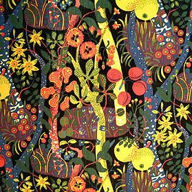
Textile design by Josef Frank
Exhibiting qualities of whimsy and the baroque as well as a surrealist approach to form, Frank's fabrics invoke such a different side of the imagination than his contemporaries in the Bauhaus and moderne movements. When all was being whittled down to streamlines or orthographic formalism, Frank produced these refined but expressive forms that we still love today. 
Textile design by Josef Frank on sofa by Anthropologie
Thursday, July 8, 2010
I Heart Engravings: Never trust an octopus
Of all things I love, books are at the top of my list, right next to millinery, engravings, sea monsters, and all things baroque. Webster's Pictorial Dictionary offers all of this to me within the bounds of a beautiful kiwi green hardcover, complete with gilded title block and sea monster illustration (okay, it's an octopus, but we all know what those can do. I'll just refer you to It Came From Beneath the Sea and King Kong vs. Godzilla. Enough said.)
Ah, rejoice my heart.
 And for all of those octopus-defending types - you know who you are - who go on and on about squids being the true culprits of aforementioned crimes:

Case closed.
Ah, rejoice my heart.


Case closed.
Thursday, June 24, 2010
2010 Color of the Year
The color of the year is...(drumroll, please): Pantone 15-5510 or, in layman's terms, Turquoise. Now I know I'm behind on reporting this. It was announced last December, but lots of other color-focused companies (Benjamin Moore, Sherwin Williams, London's Global Color Research) are jumping on board.

Now forgive me, but really? I find the choice a bit uninspired. Don't get me wrong, turquoise is actually one of, if not my absolute favorite color. It can be simultaneously earthy and airy, rich and whimsical. Its variations conjure up sea-green glass bottles, tropical water, and heirloom hydrangeas. The stone for which the color is named happens to be my birthstone. Suffice it to say that I have an attachment to the color.
 My question is when was turquoise not a color of any year? It has somehow transcended decades of fashion, design, and popular taste to remain a happy, beautiful color in everyone's book. I think it deserves a better title than color of a single, stinking year.
Ah, well. Here's to you, Pantone 15-5519.

Now forgive me, but really? I find the choice a bit uninspired. Don't get me wrong, turquoise is actually one of, if not my absolute favorite color. It can be simultaneously earthy and airy, rich and whimsical. Its variations conjure up sea-green glass bottles, tropical water, and heirloom hydrangeas. The stone for which the color is named happens to be my birthstone. Suffice it to say that I have an attachment to the color.

Ah, well. Here's to you, Pantone 15-5519.
Wednesday, June 2, 2010
I Heart Thunderstorms
I love thunderstorms, those that come crashing about us in spring and summer being at the top of my list of favorite things. It's not just the excitement of the thunder and lightning, in fact, I could just as well do without the lightning (though you can't beat it when you've a significant other to clutch). Just give me the prequel to the storm, that unmistakable electricity in the air, darkness coming on at midday, followed by rumbling thunder in the distance and fat drops of rain right behind. The best seat in the house is a rocking chair on a deep porch though a kitchen chair by a screen door does the job for me most days. I could sit contentedly for hours just listening to the storm, feeling the coolness of the air, watching everything outside drink it all in.
So for all you in Charlotte: look outside - it's storming.

So for all you in Charlotte: look outside - it's storming.

John Constable
Rainstorm over the Sea (ca. 1824-1828)
Tuesday, June 1, 2010
Art World Icon: Louise Bourgeois
Famous French-American artist Louise Bourgeois died yesterday at age 98.
Let me start by saying that I didn't think I would have to write this post. I planned to link to the Art of the Day blog of my dear friend, an art historian and librarian, who, I was sure, would have written a beautiful and enlightened tribute to one of her favorite artists. Whether from shock or lack of knowing, my friend has yet to write on the subject, so I find myself having to muster up the courage to write something myself. Here goes...
Born, raised, and trained as an artist in Paris, Louise Bourgeois moved to New York in 1938. Bourgeois' started her artistic career as a painter, but a decade after her arrival in America, she took up sculpture, the medium in which she became one of the greatest innovators in the history of art.
Her first sculptures were slender wooden figures carved from wood and painted black or white. Arranged in groups and placed vertically, the sculptures suggested a group of figures despite their abstract form. Indeed, Bourgeois called them "Personages."

As the art world moved further into abstraction to the point of near annihilation of the figure, Bourgeois remained committed to tactile, plastic sculpture. To this day, her organic, sexually suggestive sculptures of the 1960s, when Minimalism was de rigeur, give me pause. One of my favorite descriptions of Bourgeois work comes from the PBS Art: 21 series: "The anthropomorphic shapes her pieces take...are charged with sexuality and innocence and the interplay between the two."
Never crossing into fetishism or vulgarity, sculptures like Cumul I (1968) or Double Negative (1963) are almost too palpable, too explicitly plastic to view at length.

Because of her sustained explorations into the inner life of the subject, Bourgeois is often linked to Surrealism, but she was never interested in dreams for dreams' sake or sexual transgression per se. This interest in the subjective psyche is even more evident in her later work. In her 80s, Bourgeois created a series of multi-media environments composed of made and found objects that she called Cells. Complex assemblages like Cell (You Better Grow Up) (1990-93) speak to the psyche, its complexities and contradictions as well as to childhood, another recurring theme in her work.

I would be remiss if I completed this post without one mention of Bourgeois' spider sculptures. I'll admit, these creep me out, but their delicacy despite their size, make them, dare I say it, beautiful. Of course, they are also capable of terrifying small children. Maman, the most famous of these sculptures and standing over 10 meters high, refers to Bourgeois' own mother: "My best friend was my mother and she was deliberate, clever, patient, soothing, reasonable, dainty, subtle, indispensable, neat and useful as an araignée [spider]" (Source).
There is so much I must leave out: drawings, works on and with fabric, decades of work from a fertile mind. Bourgeois's productivity left us with art enough to ponder for years to come. As a woman, as an artist, as a pioneer, as an individual, Louise Bourgeois is an icon we will all remember with respect and love.
Let me start by saying that I didn't think I would have to write this post. I planned to link to the Art of the Day blog of my dear friend, an art historian and librarian, who, I was sure, would have written a beautiful and enlightened tribute to one of her favorite artists. Whether from shock or lack of knowing, my friend has yet to write on the subject, so I find myself having to muster up the courage to write something myself. Here goes...
Born, raised, and trained as an artist in Paris, Louise Bourgeois moved to New York in 1938. Bourgeois' started her artistic career as a painter, but a decade after her arrival in America, she took up sculpture, the medium in which she became one of the greatest innovators in the history of art.
Her first sculptures were slender wooden figures carved from wood and painted black or white. Arranged in groups and placed vertically, the sculptures suggested a group of figures despite their abstract form. Indeed, Bourgeois called them "Personages."

Personages (1947-50)
Photo: Suzanne DeChillo/The New York Times
Never crossing into fetishism or vulgarity, sculptures like Cumul I (1968) or Double Negative (1963) are almost too palpable, too explicitly plastic to view at length.

Cumul I (1968)
Because of her sustained explorations into the inner life of the subject, Bourgeois is often linked to Surrealism, but she was never interested in dreams for dreams' sake or sexual transgression per se. This interest in the subjective psyche is even more evident in her later work. In her 80s, Bourgeois created a series of multi-media environments composed of made and found objects that she called Cells. Complex assemblages like Cell (You Better Grow Up) (1990-93) speak to the psyche, its complexities and contradictions as well as to childhood, another recurring theme in her work.

Cell (You Better Grow Up) (1990-93)
There is so much I must leave out: drawings, works on and with fabric, decades of work from a fertile mind. Bourgeois's productivity left us with art enough to ponder for years to come. As a woman, as an artist, as a pioneer, as an individual, Louise Bourgeois is an icon we will all remember with respect and love.
Tuesday, May 4, 2010
Lee Bonticou - Sculpture in 2D
MoMA is currently running a Lee Bontecou exhibition through August 30.
I first experienced Bontecou's work at MoMA Queens in 2004. I was initially struck by the tactility of the work and her use of materials - felt, metal, clear wire, canvas. Bontecou's compositions range from kinetic whimsy to Star Wars inspired wall art (in a good way), but each piece, for all its tactility and three dimensional qualities, works remarkably in two dimensions. Take the press image that the Museum chose for the exhibition:
 At first glance, this could be the work of a (very) talented graphic artist. It is actually a photograph of one of Bontecou's kinetic sculptures (Untitled. 1980-98), which also happens to be the centerpiece of the exhibition. Don't get me wrong - seeing this piece in the flesh is breathtaking, but I wouldn't mind hanging this print on my wall either.
Some might say that all great sculpture works in 2D - art in the round means it should present well from any angle, however flat, right? Fact is that few sculptors cross the graphic divide so easily. Let's just say that Bontecou's sculpture exceeds the qualification of photographing well.
As has been my fate recently, writing about these events takes the place of actually attending them. If you're in NYC this summer, check it out and tell me what you think.
I first experienced Bontecou's work at MoMA Queens in 2004. I was initially struck by the tactility of the work and her use of materials - felt, metal, clear wire, canvas. Bontecou's compositions range from kinetic whimsy to Star Wars inspired wall art (in a good way), but each piece, for all its tactility and three dimensional qualities, works remarkably in two dimensions. Take the press image that the Museum chose for the exhibition:

Some might say that all great sculpture works in 2D - art in the round means it should present well from any angle, however flat, right? Fact is that few sculptors cross the graphic divide so easily. Let's just say that Bontecou's sculpture exceeds the qualification of photographing well.
As has been my fate recently, writing about these events takes the place of actually attending them. If you're in NYC this summer, check it out and tell me what you think.
Lee Bontecou: All Freedom in Every Sense
Canned Beer
Call me a snob, but I refuse to let the metallic taste of aluminum interfere with a good beer experience. I understand there are advantages to cans - lightweight, more easily crushed against the average frat boy's skull, etc., but food and drink is one area in which I fail to see how the utilitarian argument prevails.
Then comes along Oskar Blues Brewery out of Colorado, and, you guessed it, their line of specialty brews are available in cans only.

Why?! Our local beer guy (here's the plug for Brawley's in Charlotte) told my boyfriend that it's designed for campers (the lightweight factor coming into play), but we all really know that the cans raise the beer's hipster quotient. That alone made me want to dislike the beer, but... erg... it's actually good beer.
 Oskar Blues started with Dale's Pale Ale, the "first hand-canned craft beer," but the label has now grown to seven brews. We tried the foundational Dale's Pale Ale as well as their Gordon Ale, which the company describes as an Imperial Red/ Double IPA. Being an IPA fan myself, you can guess which I prefer, but I'm not cool enough to say I didn't notice the metallic tinge.
So while I'll admit this is worth trying, my advice to all those hip campers: carry a glass or, er, enameled tin cup for pouring.
Then comes along Oskar Blues Brewery out of Colorado, and, you guessed it, their line of specialty brews are available in cans only.

Why?! Our local beer guy (here's the plug for Brawley's in Charlotte) told my boyfriend that it's designed for campers (the lightweight factor coming into play), but we all really know that the cans raise the beer's hipster quotient. That alone made me want to dislike the beer, but... erg... it's actually good beer.
 Oskar Blues started with Dale's Pale Ale, the "first hand-canned craft beer," but the label has now grown to seven brews. We tried the foundational Dale's Pale Ale as well as their Gordon Ale, which the company describes as an Imperial Red/ Double IPA. Being an IPA fan myself, you can guess which I prefer, but I'm not cool enough to say I didn't notice the metallic tinge.
So while I'll admit this is worth trying, my advice to all those hip campers: carry a glass or, er, enameled tin cup for pouring.
Subscribe to:
Posts (Atom)